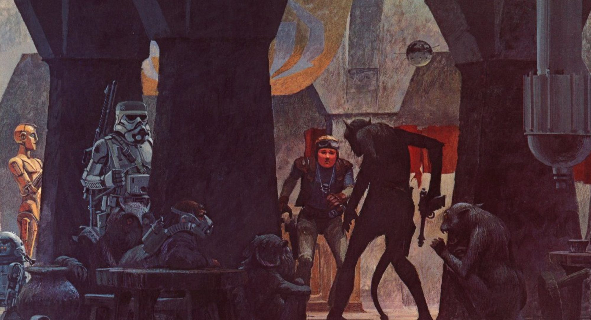
 Today’s #RPGaDay2015 topic is Favorite RPG Illustration. There are so many I could choose from that I’ve loved: The covers of STAR FRONTIERS and JUSTICE INCORPORATED (a cover I loved so much, in fact, that I licensed the artwork so that I could re-use it for Adamant’s THRILLING TALES Savage Worlds book, and also offer it as as a poster), interior illustrations such as Tim Bradstreet’s work on the first edition rulebook for VAMPIRE: THE MASQUERADE, or Jim Holloway’s work on the first edition of CHILL, or even re-used artwork from non-RPG sources, such as the color plate inserts from the Games Workshop hardcover edition of CALL OF CTHULHU, which used a bunch of horror art, including The Croglin Vampire by Les Edwards. I could go on and on.
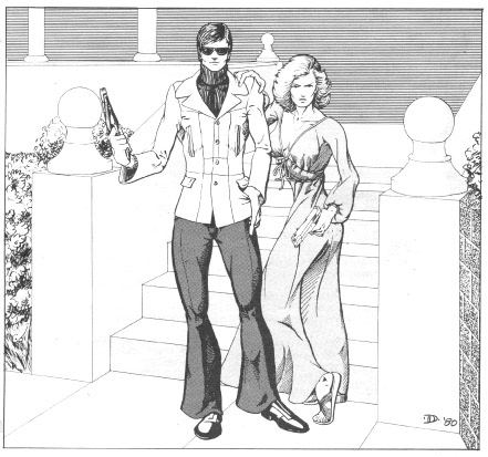
Despite all these fantastic choices, though, I’m going to pick something which isn’t particularly flashy or dynamic — a simple pen-and-ink illustration of two characters. This was the interior title page illustration from the very first RPG I ever owned or played, TSR’s first edition of TOP SECRET. The illustration is by Jeff Dee:
That’s it. With that one picture, with the flared pants and the turtleneck, with the pistols and the expressions on the characters’ faces, Jeff Dee managed to distill turn-of-the-80s Spy Cool. I knew that within those pages, I could create a spy to put James Bond to shame. I know it looks really goofy now, but that illustration grabbed me and didn’t let go — and that’s what an RPG illustration SHOULD do.
Here’s Dave Chapman, who talks about his choice (which is another of my favorites), with special guest Jon Hodgson from Cubicle 7 who talks about several of his:


