
I’ve seen this on a couple of people’s journals, so here’s my Top Five:
In countdown order:
#5: Vampire: The Masquerade by White Wolf:

I tried to find an image of the original edition, but couldn’t find one. This is pretty much the same, apart from the title logo. Green Marble with a rose. Simple and elegant.
#4: Traveller (original black books) by GDW:
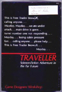
OK, that image is ass, and the copy is dinged up, but I couldn’t find any other images of that first set. The GDW “little black books” were stark in an age of lurid pulp-y covers, and perfectly reflected the futuristic feel of the Traveller game. They were a brilliant bit of branding, too, as everything released shared that trade dress. An online fan even created this site, which allows you to generate your own custom Little Black Book covers, which is just cool as hell.
#3: Top Secret (original edition) by TSR:

I am biased. This was my first RPG. But come on! Look at that cover, and tell me that it doesn’t make you want to put on a trenchcoat, grab the gun and the files, and go meet up with the owner of the legs in that photo.
#2: Nobilis by Hogshead Games:

Deco beauty. The world’s first coffee-table-book RPG.
#1: Justice, Inc. by Hero Games:

They don’t get much better at bringing across the feel of the game than this one. Even more amazing is that it was an original work, not a period image. Compare to the cover of the current version of the game, Pulp Hero, and mourn for what has been lost.
I notice a lot of “old school” stuff in my top 5. I guess that makes me an “old man.” Fuck it, so be it. There aren’t too many covers that come out now that really blow me away.
I’d like to add that the cover of the Traveller book makes just about the perfect “movie trailer” for the game, even with just white text on a black screen.
Doug.
“Compare to the cover of the current version of the game, Pulp Hero, and mourn for what has been lost.”
Oh, yech. That new picture is ass. :-/
I mean, it’s not just ass at conveying the pulp feel. It’s ass in a much more general sense.
Works for me. The only one I might substitute out is the first edition Shadowrun cover, but for the life of me, I can’t figure out which one I’d drop for it.
Hero Games’ philosophy on artwork of late has really left me cold. It reminds me of the joke about the race car designer who considers the driver that 150 lb piece of ballast that has to go in front of the engine. It’s not so much an afterthought as no thought at all. Still, if you’re largely marketing to an established fan-base (which seems to be Hero’s approach), I guess the art really doesn’t matter.
Perhaps I spoke too soon about current covers not blowing me away.
It’s a Polish game, so I’ll never get it, and if I do, I won’t be able to read it, but check out this cover that discovered:
Heh. I have that :p
Actually we already have the license to translate a couple of that companies games and are exploring the possibilities of some of their others.
It is very nice (from my non-existent Polish pov – but I have had it explained to me).
Just wait until you see the front cover of Cannibal Sector One! OK so it’s a supplement but it’ll still blow people away (hopefully anyway! :p)
Nobilis – still my favorite cover of all time.
What a damned pretty book.
This from a complete non-RPG-er…I just got a look at the book that a bunch of‘s work is in and of course, for the life of me, can’t remember the title.
But dayum…it was gorgeous. And she’s moving to Lawrence!
Some excellent choices, and I was always a big fan of Top Secret.
I would have to say that some of my favorite covers include:
Adventure! – I always dug the pulp feel of the cover. You get a good idea of what the feel is.
The Q Manual (for the often ignored, but damned well written James Bond RPG)
Heavy Gear (I never played the game ort even bought any of the books, but I remember adoring the way they laid out their books).
When Gravity Fails for Cyberpunk. The Budayeen Middle Eastern setting based on George Alec Effinger’s book. Good stuff. Clerarly tells you it’s not your standard cyberpunk.
Corsairs of the Great Sea for the Al-Qadim setting. I think it’s still one of the most under-appreciated settings for D&D.
Shadow Knight for Amber. I’m a sucker for Kucharski’s artistic style, and the cover tells you a lot if you’re familiar with events in the Second Chronicle.
I’m a huge fan of the 1st/2nd Ed. Vampire book. About six years ago, the Source, our gaming mecca up here in the hinterlands, disposed of a huge pile of 1st ed. Vamp books somebody had found in the back room for $5 a pop. I treasure the one I picked up.
Bah. Its the CONTENTS that are important! (Uppity artists.. grr…)
Van Helsing Hunter D!